
Red Haven Rebrand*
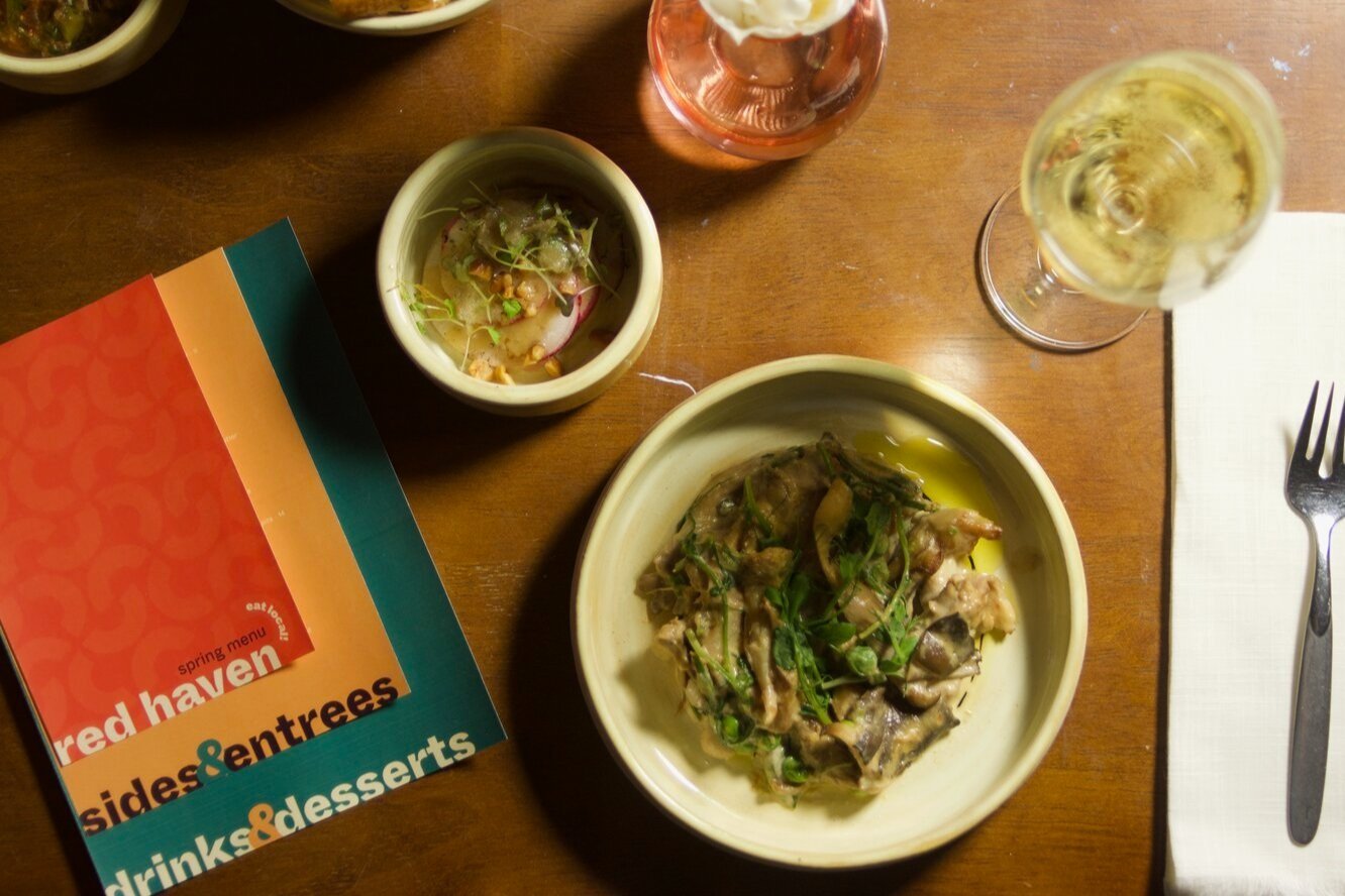
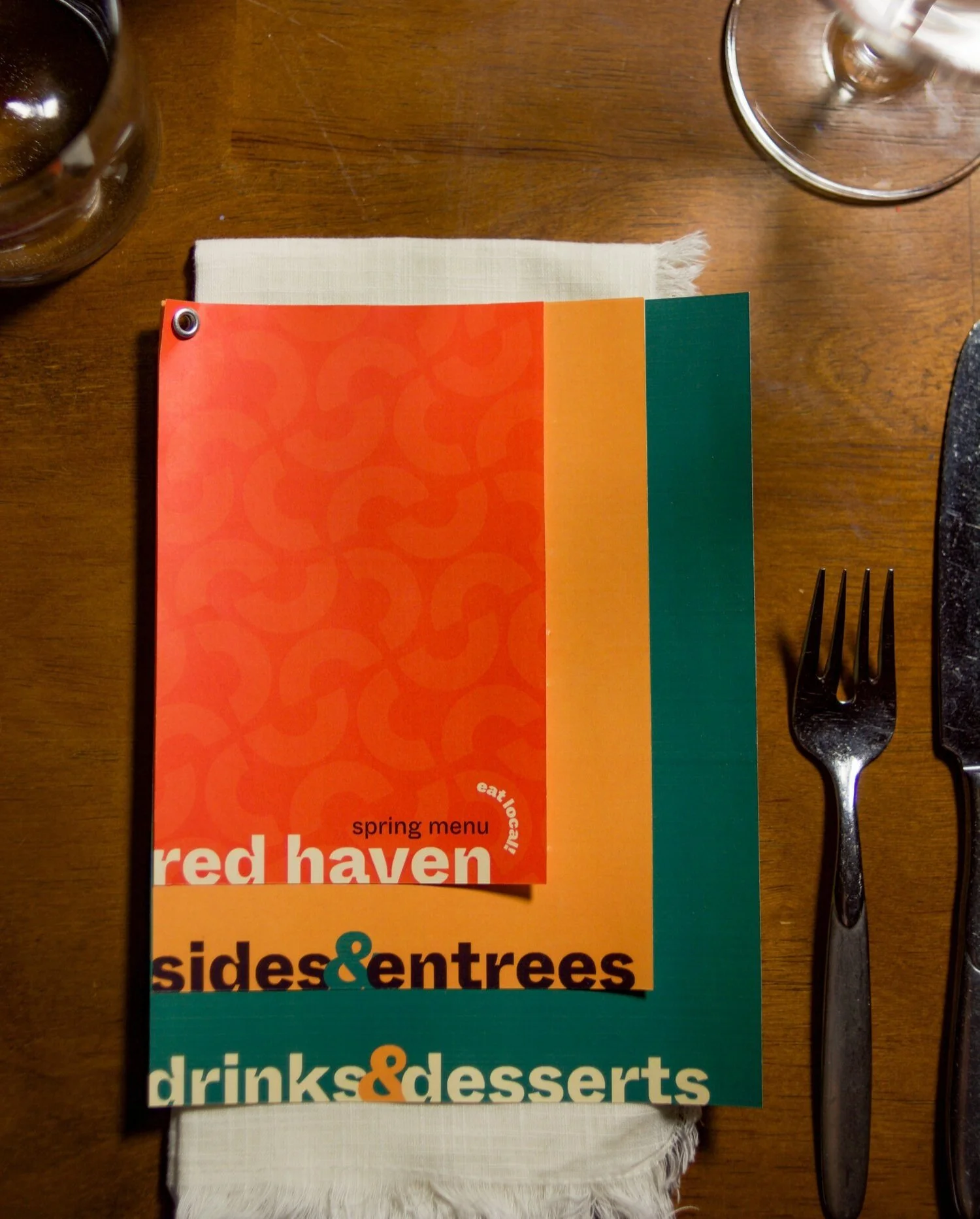
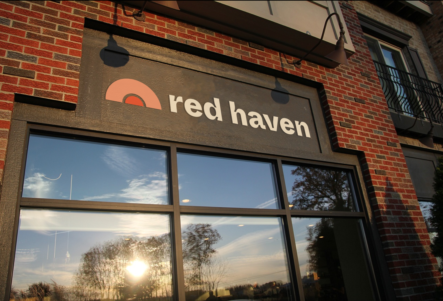
*Conceptual student work Services: Branding + PrintRed Haven, an upscale, farm-to-table restaurant in Okemos, MI, provides bold and inventive culinary experiences, but their brand lacked those qualities. Utilizing typography in the macro and micro scale, we aimed to create a more cohesive, modern identity for the restaurant.
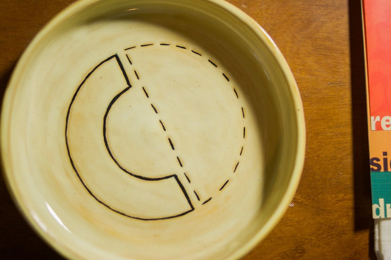
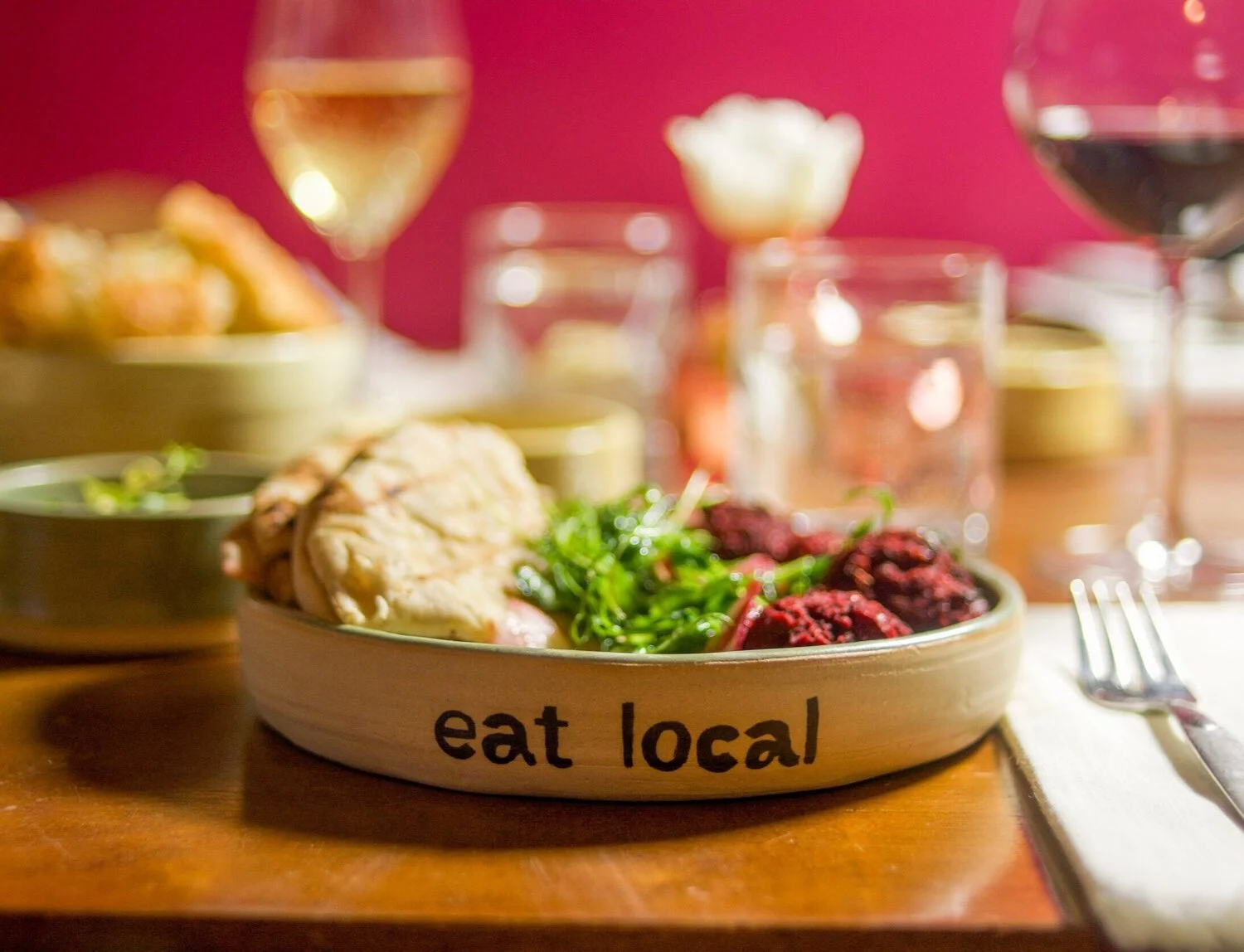
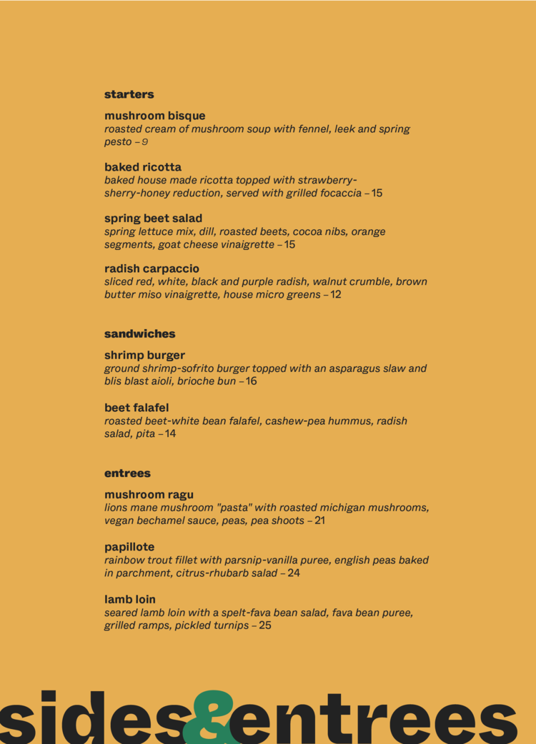
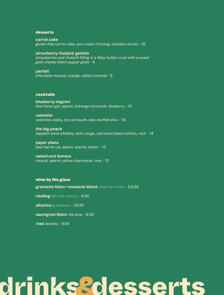
The red haven peach, from which the restaurant gets its name, became our inspiration for palette and shape, using a simplified shape and bright colors to modernize the brand. We implemented our new system across signage, dishware, menus, and business cards.

Contributors
Professor: Kelly Salchow MacArthur
Contributors: Valerie Hogg, Emma Simon
Ceramics: Emma Simon